Warning: These 15 Paint Colors Will Make Your Home Difficult to Sell | Paint Colors to Avoid
Choosing the right paint color might seem like a simple design task, but it has a big impact when you’re trying to sell your home. Certain paint colors can make a home feel smaller, darker, or less welcoming—things that turn off potential buyers.
Real estate professionals often notice that specific colors cause homes to sit on the market longer or sell for less money. By learning which colors to avoid and why, you can pick shades that make your home look more inviting and help buyers picture themselves living there.
1. Dark Brown That Makes Spaces Feel Cramped
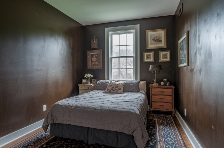
Dark brown might look stylish in design magazines, but in real homes it tends to make rooms feel tight and gloomy. This color soaks up light and makes spaces look smaller than they are. In rooms like bedrooms and living areas, where light and space are important, dark brown can feel heavy and outdated.
Lighter options like taupe or greige still feel warm but help rooms look bigger and brighter, which is exactly what buyers want.
Better Alternatives to Dark Brown
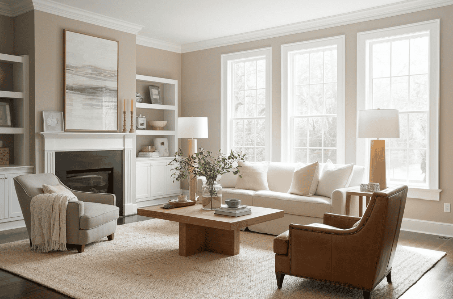
Switching from dark brown to a soft neutral, such as warm beige or greige, helps create a welcoming space that feels open and airy. These tones look great in photos and in person. You can still bring in richness with brown-colored furniture or accessories.
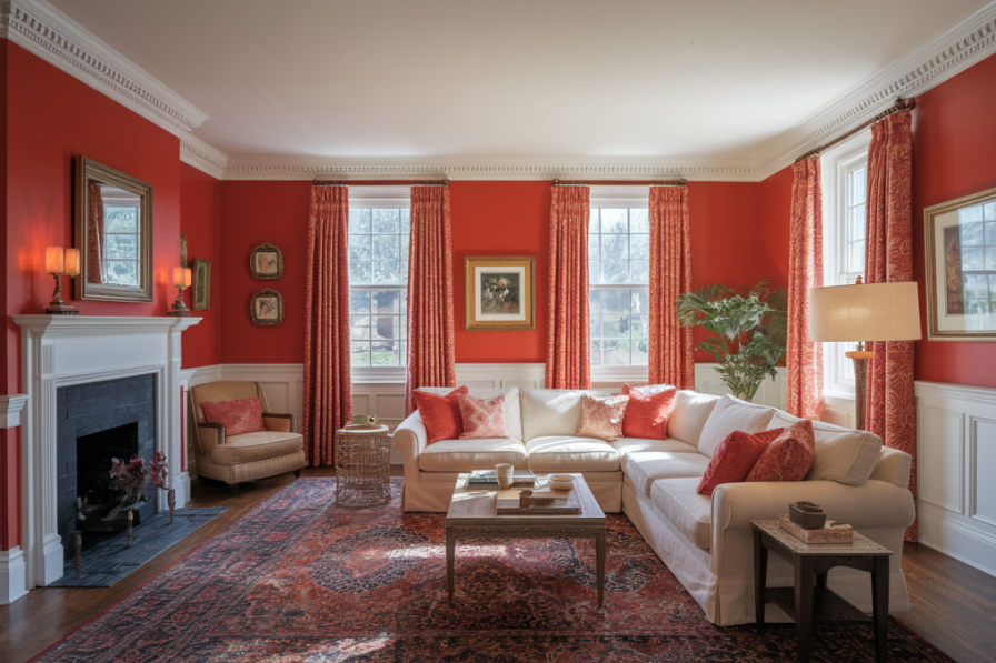
2. Bright Red That Creates Emotional Barriers
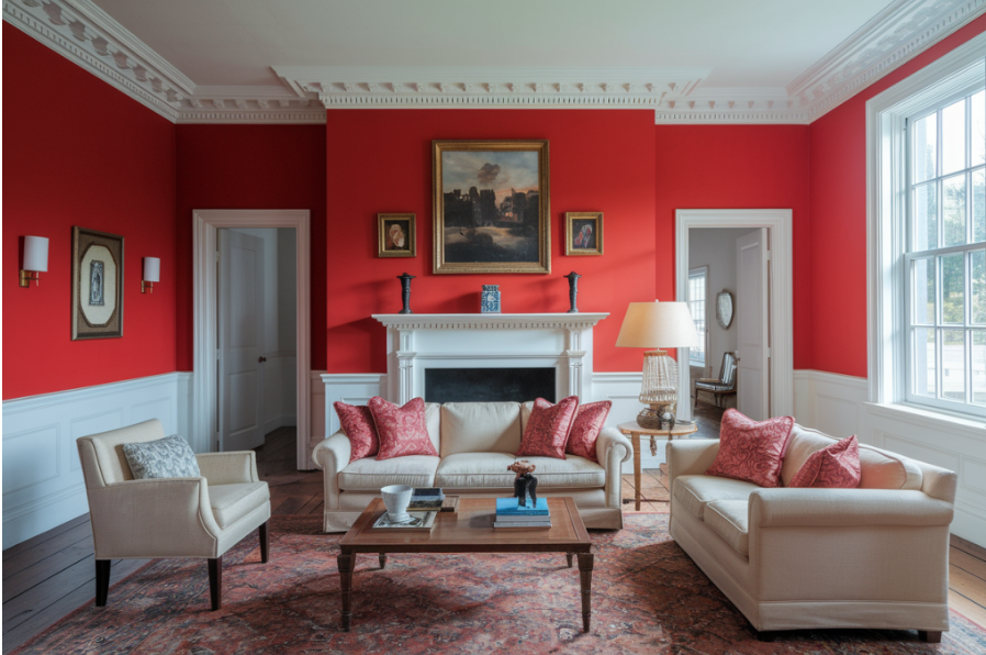
Bright red walls can make a strong impression, but not in a good way for home buyers. Red is linked to strong emotions like stress or anxiety, and this can make your home feel less relaxing during showings.
Many buyers also see bright red as a sign they’ll need to repaint right away, which could hurt your selling price. If you love red, keep it to smaller accents or one wall in a dining room. A little red goes a long way without overwhelming buyers.
Red Accent Options Work
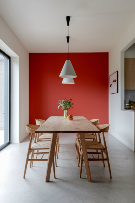
A better way to use red is through accents like pillows, artwork, or even one wall in a social space like a dining room. This adds energy without scaring buyers.
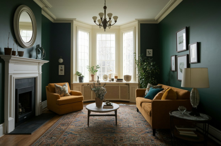
3. Black Paint That Shrinks Visual Space
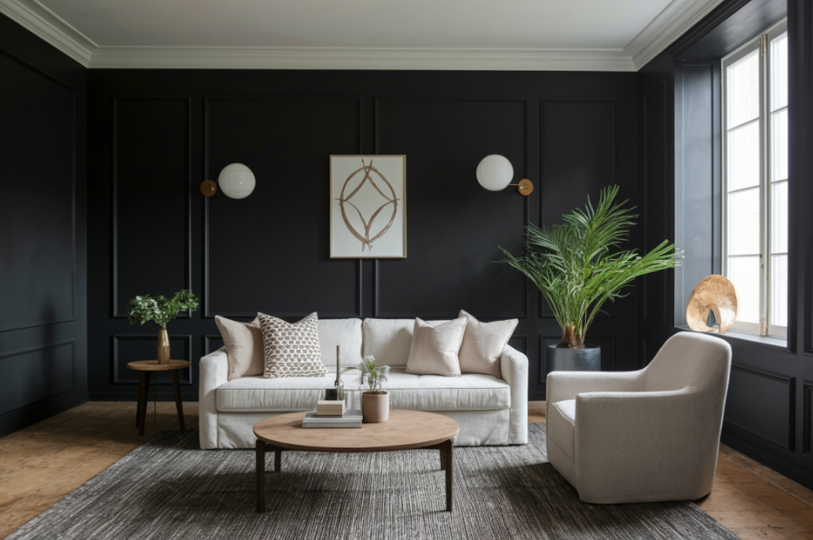
Black walls can look dramatic, but they make rooms feel darker and more closed in. This effect is even more noticeable in real estate photos, which are usually a buyer’s first impression. Black also shows dust and flaws easily, making a home look harder to maintain.
If you like dark tones, try charcoal or navy instead. These colors feel rich but let light bounce around better, especially in rooms with good natural lighting.
When Dark Colors Can Work
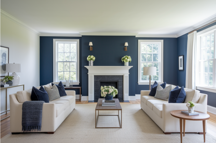
If used sparingly in spaces like media rooms, deeper colors like navy or charcoal can work. Make sure the room has plenty of light and high ceilings. For broader appeal, keep the rest of the palette light.
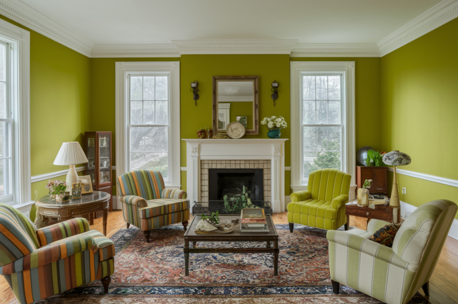
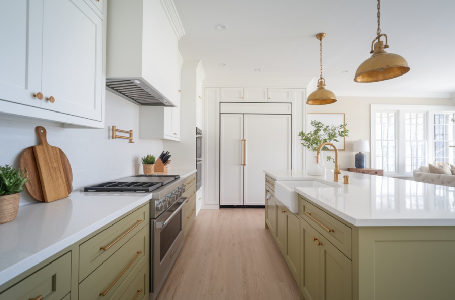
4. Unusual Greens That Create Disconnect
While greens like sage or olive are popular, bright lime or murky avocado greens can feel dated or too intense. These shades often remind buyers of past decades or child-themed spaces, which may limit the home’s appeal.
Green Tones for Increasing Value
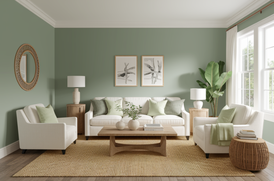
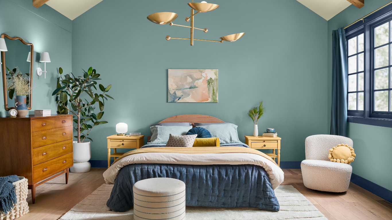
Go for green tones with beige or gray undertones—soft sage or muted olive can create calm, livable spaces. These colors are great in bedrooms and living rooms.
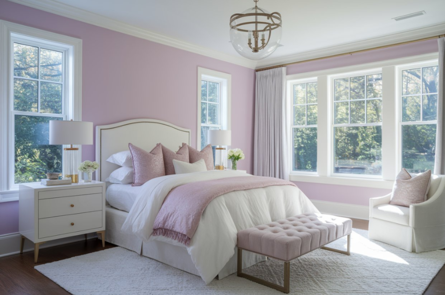
5. Purple That Presents Age-Related Challenges
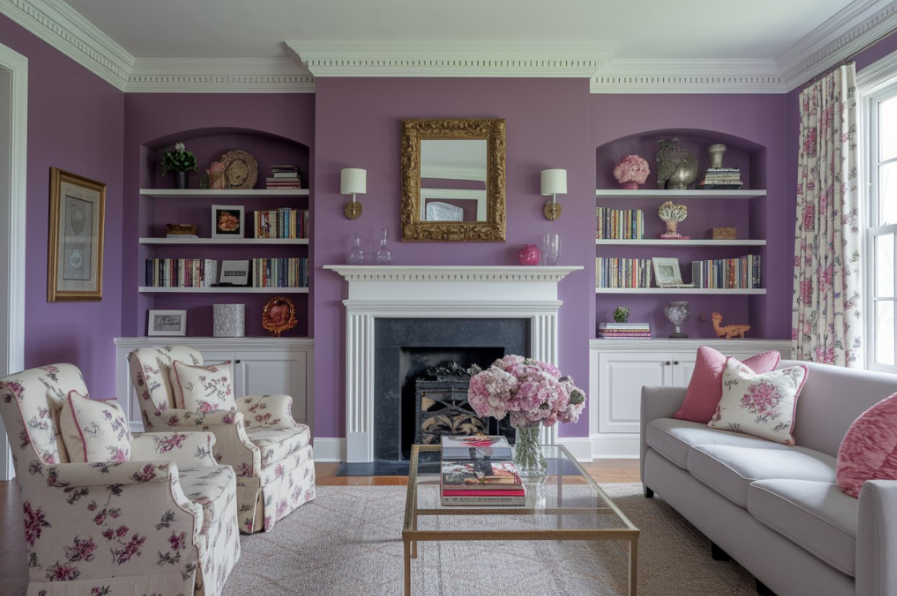
Purple, especially in bold or bright tones, can feel overly personalized and limit your buyer pool. It’s seen as too feminine or dramatic, turning off those who prefer neutral environments.
The Psychology Behind Purple Aversion
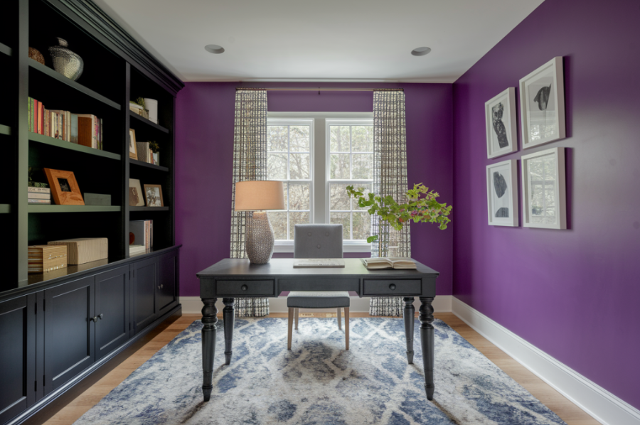
Lavender or mauve are better options if you enjoy purple. These are softer, more neutral tones that appeal to a broader audience. Accessories in purple can also work without overwhelming the space.
6. Bright Yellow That Creates Visual Fatigue
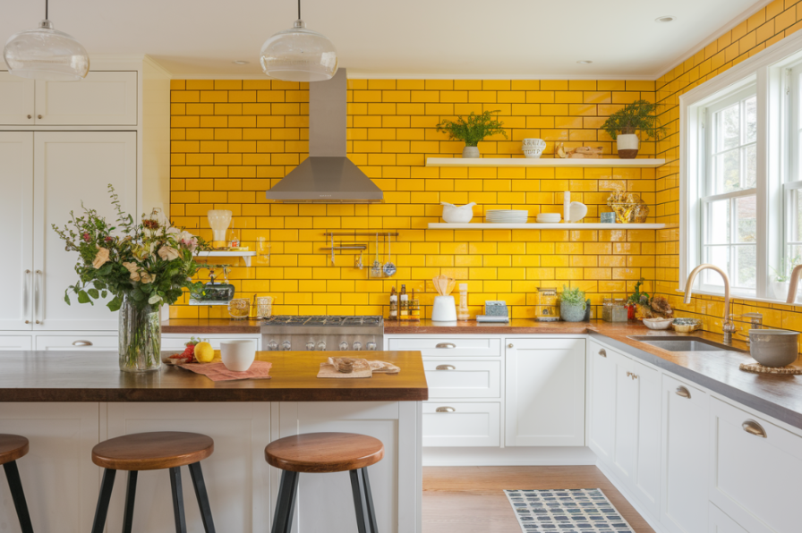
Bright yellow might seem cheerful, but it’s hard on the eyes during long showings. It also tends to show flaws and requires extra coats for proper coverage. These issues make it a tough sell.
These Yellow Alternatives Won’t Scare Buyers
Choose warm, pale yellows or buttery creams. These provide the same sense of warmth and light without being overpowering.
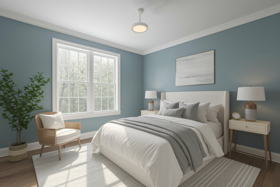
7. Electric Blue That Disrupts Tranquility
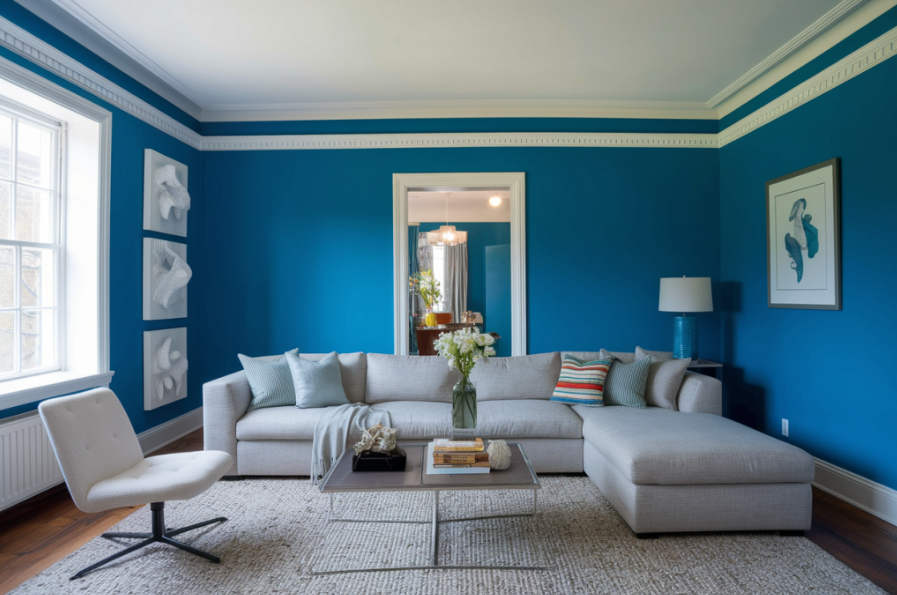
Electric blue creates overstimulation, which buyers usually don’t want in a home. It’s hard to paint over and often appears even more intense in listing photos.
Blue Tones for Enhancing Value
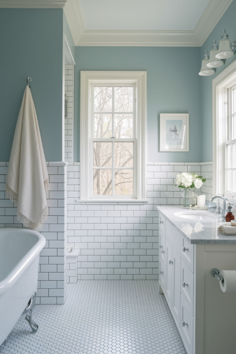
Go with calming tones like powder blue, slate, or muted navy. These feel fresh and clean, especially in bathrooms or bedrooms.
8. Intense Orange That Limits Buyer Demographics
Bright orange can be too loud and limit your appeal to younger buyers. It also makes rooms feel busy and is hard to photograph well.
Working With Orange Accents Safely
Use orange through decor like throw pillows or wall art. If you really want orange on the walls, try peach or terracotta, which are more subtle.
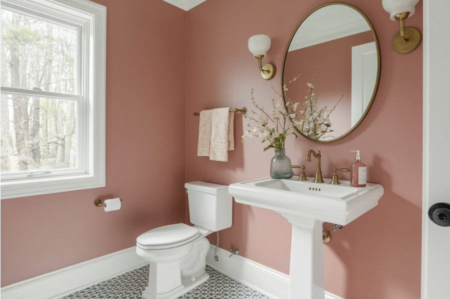
9. Hot Pink That Screams “Repaint Me”
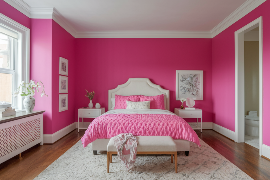
Hot pink is highly specific and often seen as youthful or feminine, alienating many buyers. It’s also hard to cover during repainting.
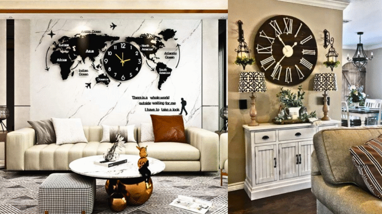
1. Quick Swaps to Refresh Any Room:
Before reaching for a paintbrush, consider these quick home refresh ideas that can transform your space without the risk of color regret.
2. Home Upgrades:
Choosing the right paint is just one part of smart remodeling—explore these easy home upgrades that add value and elevate your interiors effortlessly.
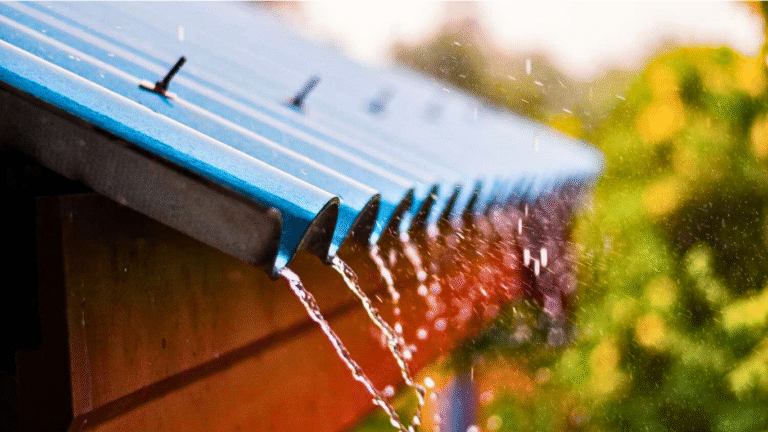
3. Floor Maintenance Mistakes:
Your floor color and condition can influence how paint looks—avoid these common floor maintenance mistakes to ensure your paint choices stand out for the right reasons.
These Pink Tones Don’t Hurt Resale Value
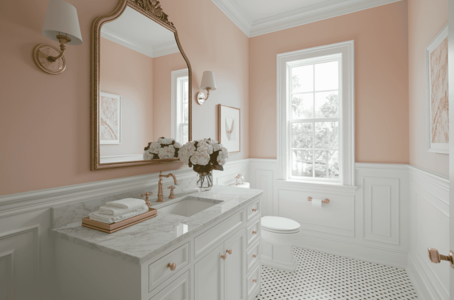
Use blush or soft rose for warmth that still feels neutral. These tones can enhance powder rooms or guest rooms.
10. Metallic Paints That Create Distraction
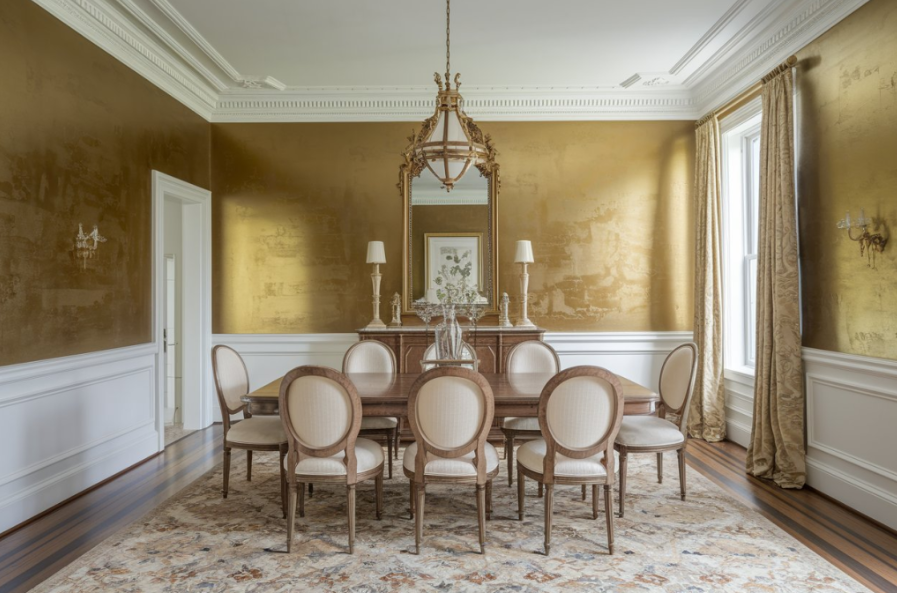
Gold or silver metallic finishes tend to reflect too much light and highlight flaws. Many buyers see them as outdated or overly flashy.
Better Ways to Add Metallic Elements
Add metallic touches with light fixtures, hardware, or accessories. These give a high-end look without making walls feel overwhelming.
11. Deep Purple That Creates Lighting Problems
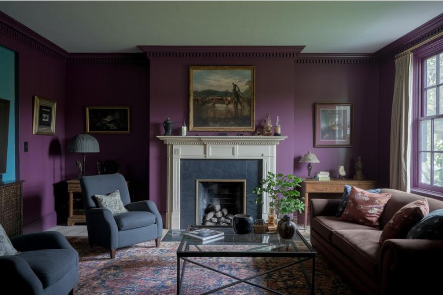
Dark purples absorb light and make spaces feel small and shadowy. Even natural light won’t fully help. They also give off a serious tone that doesn’t fit most living spaces.
Softer Purples Won’t Turn Off Buyers
Lavender or light mauve reflect light better and feel calming. These work great with neutrals and gold finishes.
12. Lime Green That Hurts First Impressions
This color is overwhelming and draws attention away from the room itself. It also shows wall flaws and clashes with many styles.
Safer Greens Attractive to Buyers
Go with eucalyptus, sage, or light olive. These are soft, natural shades that photograph well and work with many finishes.

13. Vivid Turquoise That Limits Buyer Appeal
This bold shade narrows your buyer pool and can photograph poorly online. Bright turquoise turns off many buyers looking for neutral homes.
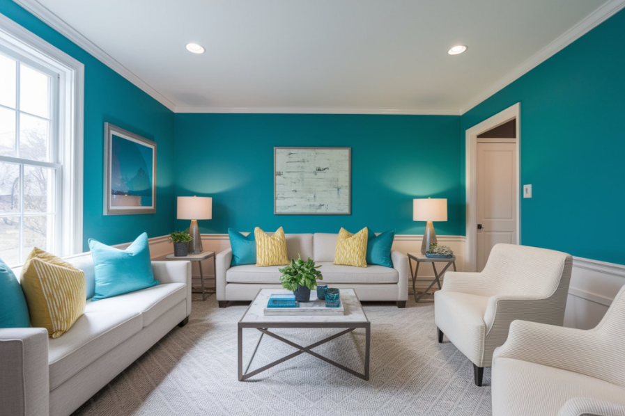
Softer Blues Sell Homes Faster
Try sky blue, soft teal, or aqua instead. These create a refreshing, beachy vibe that appeals to more people.
14. Dark Green That Makes Spaces Feel Outdated
Colors like hunter green or forest green often remind buyers of older design eras. These shades make spaces feel dim and dated.
Greens for Fresh and Contemporary Feel
Use modern green tones like misty sage, silvery olive, or light eucalyptus. These feel airy and current.
15. Dusty Mauve That Feels Tired and Outdated
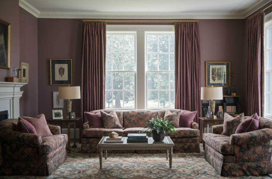
Once trendy, dusty mauve now feels old and clashes with modern decor. It can make a room feel lifeless.
Sophisticated Pinks Don’t Feel Stuck in the Past
Try warm mushroom pink or beige-blush. These are soft but modern and look great with gold or black hardware.
Conclusion ( paint colors to avoid )
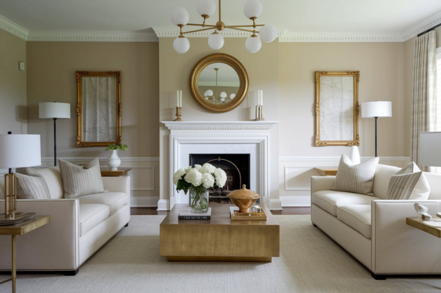
When you’re getting ready to sell, picking paint colors that attract the most buyers is key. Safe choices like greige, creamy white, and warm taupe help buyers focus on the space—not the walls.
These shades are easy to match with furniture and make your home feel clean, bright, and move-in ready. Even if you love bold colors, switching to neutrals before selling can help your home sell faster and for a better price. It’s a simple change that can make a big difference in your bottom line.