16 Carpet Color Mistakes To Avoid
Carpets are a big part of your home’s design. They add warmth, comfort, and help tie a room together. But picking the wrong carpet color can make your home feel unbalanced or lead to costly changes down the road.
The best carpet color should match your furniture, lighting, and how you use each room. It should help your home feel welcoming, cozy, and easy to care for—not too dark, too bright, or hard to keep clean.
Ignoring How Light Affects Color
Carpet colors look different depending on how much sunlight a room gets. A color that looks nice in the store might appear darker or duller at home. Always try carpet samples in your actual space at different times of day to see the real color.
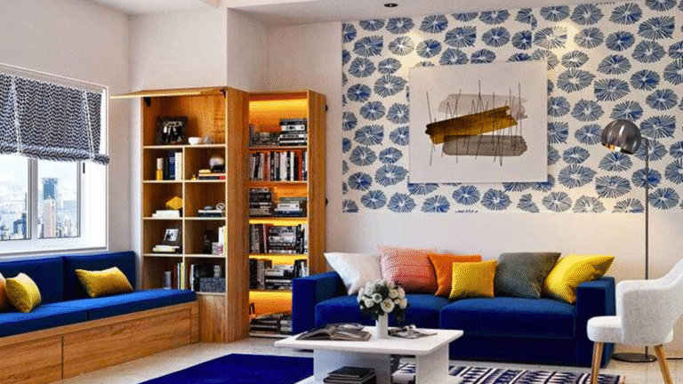
Picking Trendy Colors That Don’t Last
Trendy carpet colors like bright teal or bold patterns might be fun now, but they often go out of style quickly. Since carpets stay in place for many years, it’s smarter to pick classic colors like beige, gray, or taupe. These work with many decor styles and are easier to update with pillows or artwork.
Selecting Pure White Carpeting
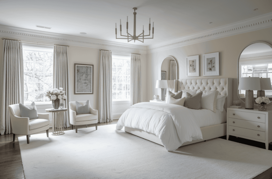
White carpet may look fresh and clean in photos, but it’s hard to keep that way. It shows every stain, footprint, or spill. A better choice is light cream, off-white, or light gray. These colors still look bright but hide messes more easily.
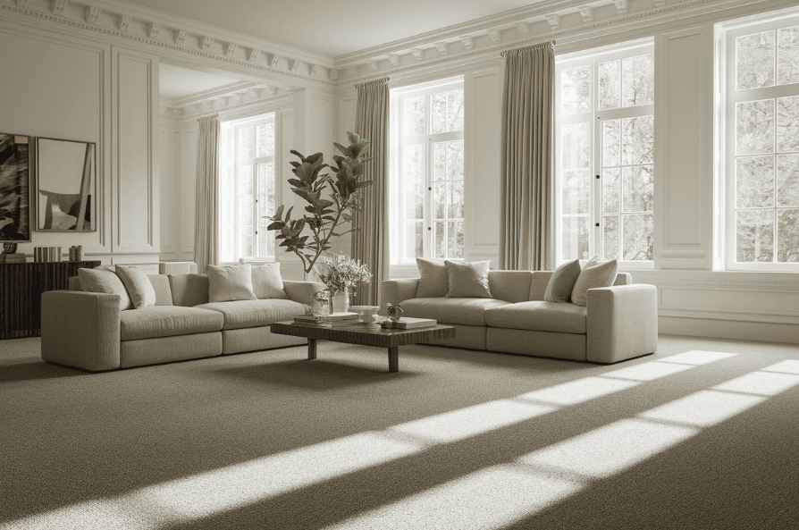
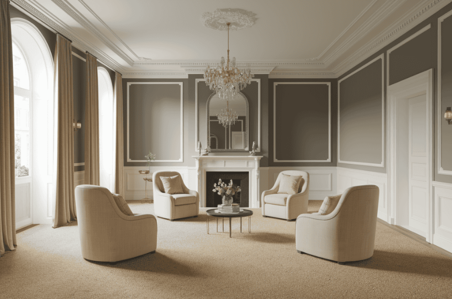
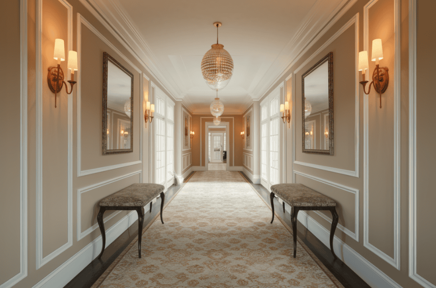
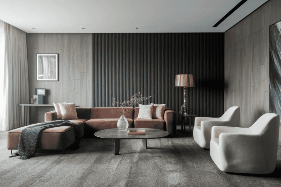
Going Too Dark in Small Rooms
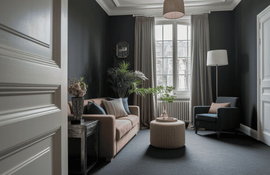
Dark-colored carpets can add drama, but in small spaces, they make rooms feel smaller and heavier. That’s because dark colors absorb light. Lighter carpets help reflect light and make small rooms feel more open. Use dark colors in big rooms instead.
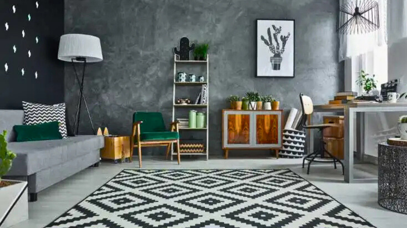
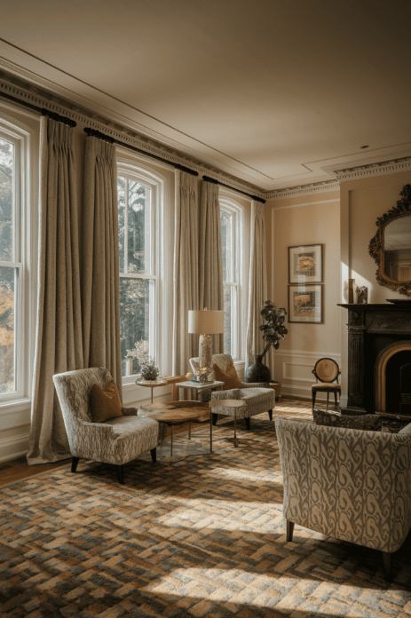
Picking Colors That Show Every Speck
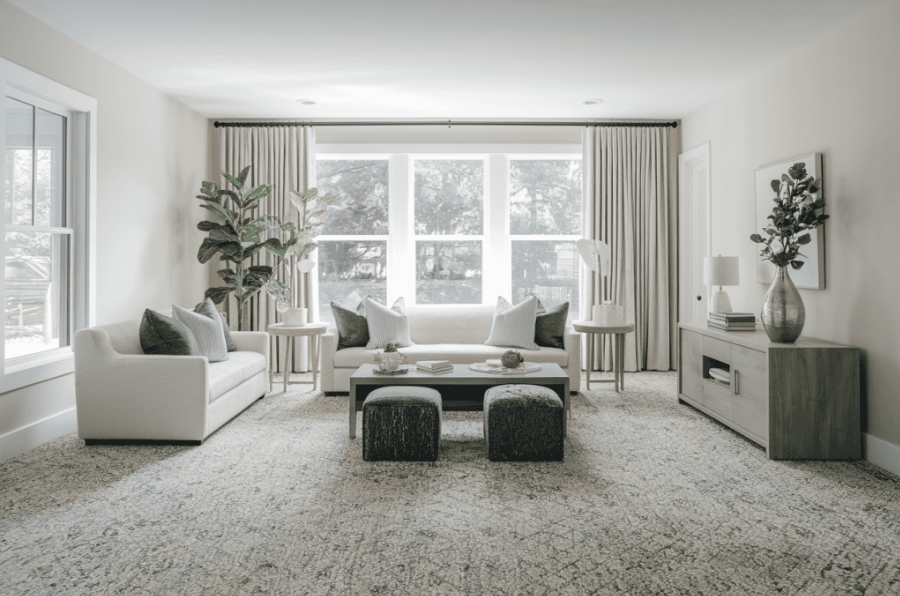
Some colors, especially medium-toned solid carpets, tend to show every bit of dirt, pet hair, and crumbs. For busy spaces, choose carpets with patterns, flecks, or mixed tones that hide mess better between cleanings.
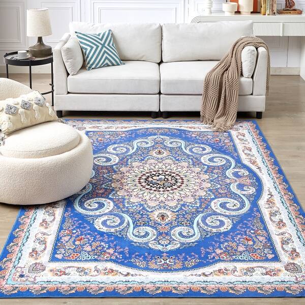
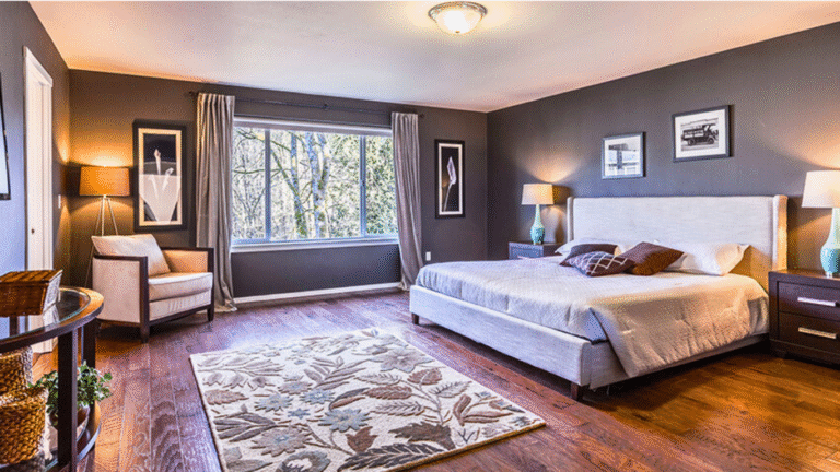
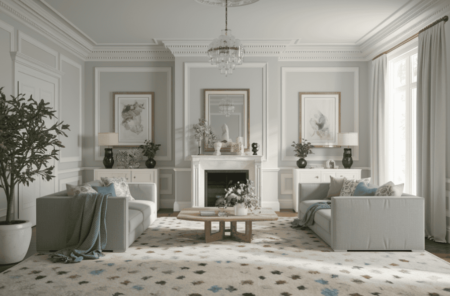
Not Matching Your Furniture
Carpet doesn’t have to match your furniture exactly, but it should go well with the colors and style. Bring fabric swatches or photos of your furniture when carpet shopping to make sure the tones work together.
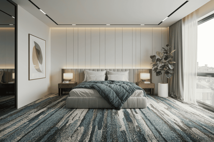
Clashing Undertones
Even neutral carpets have undertones—some lean pink, yellow, green, or blue. These can clash with wall colors or furniture. Always compare your carpet samples with your paint and furniture in natural light to make sure everything feels right together.
Forgetting About Fading
Carpet colors can fade in rooms with a lot of sunlight, especially darker or brighter shades. Over time, you may notice lighter patches where furniture or rugs used to sit. For sunny spaces, pick fade-resistant carpets or lighter tones that won’t show fading as much.
Judging by Small Samples
Small carpet samples can be misleading. A color or pattern that looks great on a small swatch might look very different once installed across an entire room. Ask for larger samples or use room visualizer tools to get a better idea of how the carpet will look.
Ignoring Your Lifestyle
A carpet that looks beautiful may not work well if you have kids, pets, or frequent guests. Think about how you live day to day. Medium-tone carpets with patterns or textures are great for hiding stains and wear in busy homes.
Not Thinking About the Room’s Purpose
Each room in your house serves a different purpose, and your carpet choice should reflect that. Use lighter, more delicate carpets in guest rooms or low-traffic spaces. Choose tougher, stain-resistant carpets for places like hallways, family rooms, or stairs.
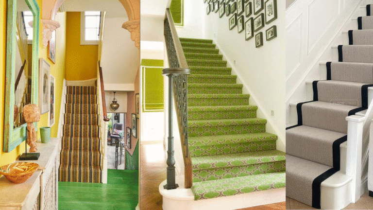
Using Clashing Carpets in Nearby Rooms
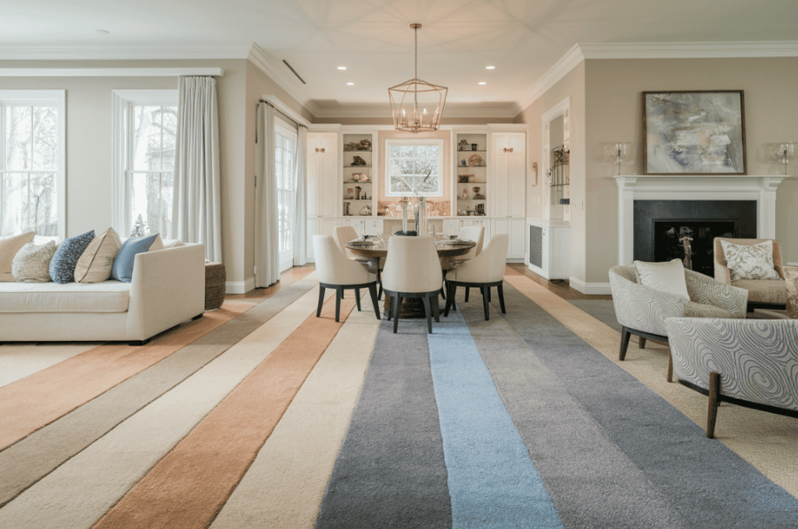
If two rooms next to each other have very different carpet colors, the transition can look choppy or messy. Stick with carpet colors from the same family or tones that flow well from one room to the next. This creates a smooth, connected look.
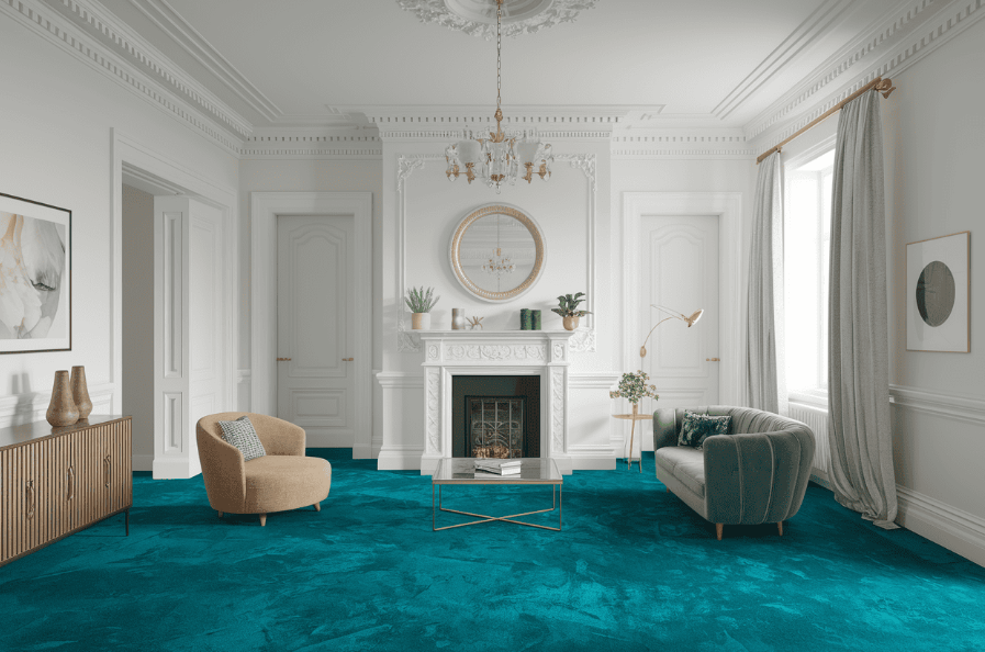
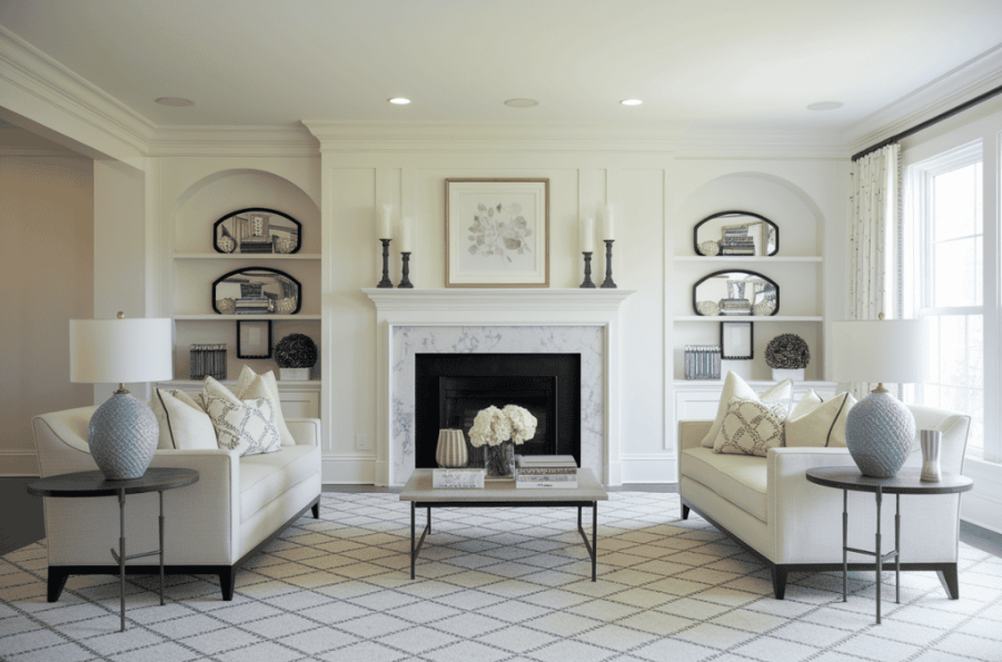
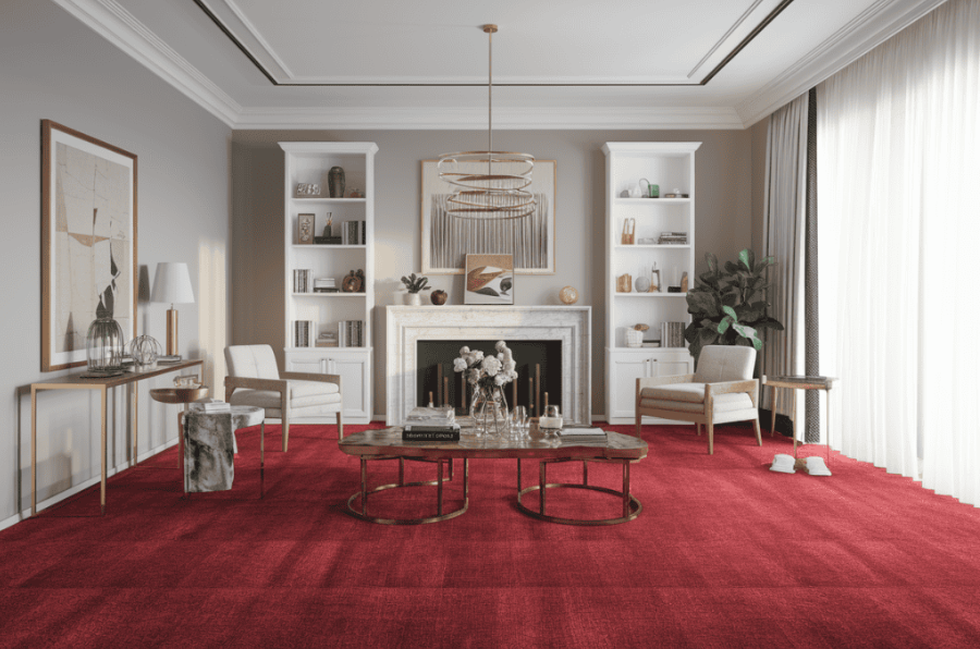
Matching Carpet and Wall Color Exactly
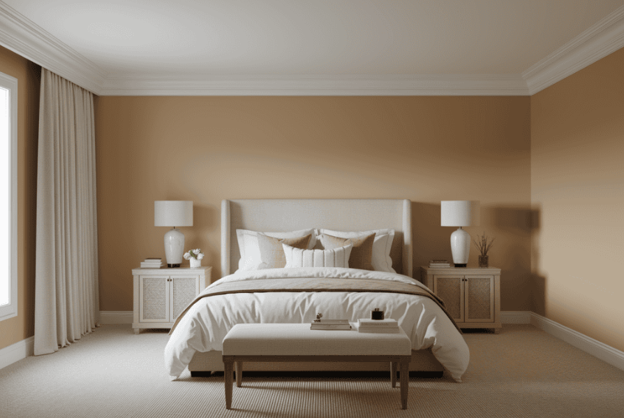
If your carpet is the same color as your walls, your room might look flat and boring. Instead, choose carpet that’s a bit lighter or darker to create contrast. This adds depth and makes the space feel more stylish and balanced.
Forgetting Carpet Texture Changes Color
Carpet color doesn’t always look the same across different materials or textures. The same shade might look lighter in one texture and darker in another. Always test the carpet in the exact material and pile you plan to install.
Following Outdated Rules
Old rules like “dark carpets always make rooms feel small” or “you should only use beige” don’t always apply today. New carpet styles and materials have changed things. Some darker shades reflect light better now, and modern neutrals offer more style options.
Not Thinking About Resale Value
If you’re planning to sell your home in the future, avoid carpet colors that are very bright or unusual. Choose neutral shades that most buyers will like. You can still show your personality with things like rugs or decor instead.
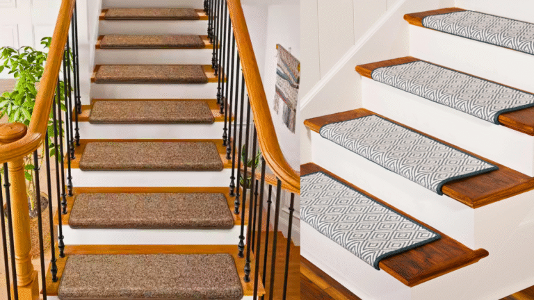
Stair Carpet for Comfort and Safety
Stair carpet makes your stairs safer and more comfortable. It helps prevent slipping, reduces noise, and adds a nice look to your home. If you want to learn more about which type to choose and how to install it, check out this stair carpet guide.
Conclusion: ( Carpet Color Mistakes To Avoid )
Choosing the right carpet color helps your home look better and feel more comfortable. It should suit your daily life, match your furniture, and be easy to take care of.
By avoiding these common mistakes, you’ll pick a carpet that looks great and lasts a long time. Carpets are both practical and stylish. When you plan carefully, you’ll find a carpet that fits your needs, looks beautiful, and makes your home feel just right.