25 Kitchen Cabinet Colors Ideas That Actually Make Your Kitchen Look Bigger
Choosing the right cabinet color can make your kitchen feel noticeably bigger and more open. With so many tones to pick from, the right choice can brighten, reflect light, and even make tight corners vanish visually. These 25 fresh, modern, and space-enhancing cabinet colors are perfect for giving your kitchen that roomy feel you want.
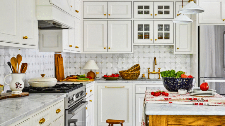
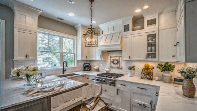
1. Soft White with Warm Undertones
This shade brings a clean and airy feeling that instantly opens up the room. The warm undertones soften the starkness often associated with white, making the kitchen feel cozy rather than cold. It complements a wide variety of materials and is especially effective in spaces where natural light is limited.
2. Alabaster White (Matte Finish)
Alabaster white in matte creates a smooth, velvety look that evenly distributes light. Unlike glossy finishes, it removes harsh reflections while maintaining a light and fresh feel. It’s a great fit for smaller kitchens where calm, soft finishes can create a sense of quiet openness.
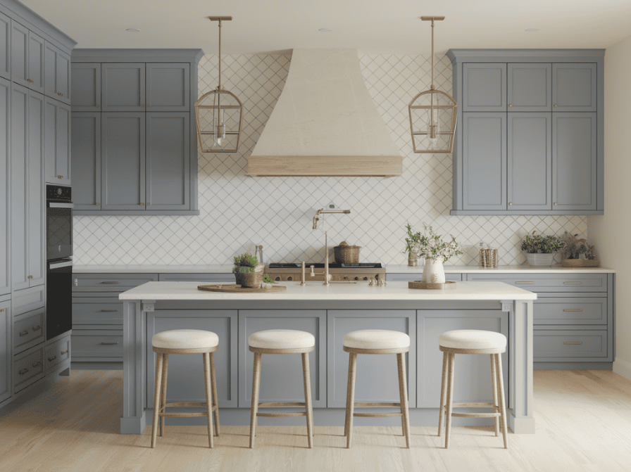
3. Light Dove Gray
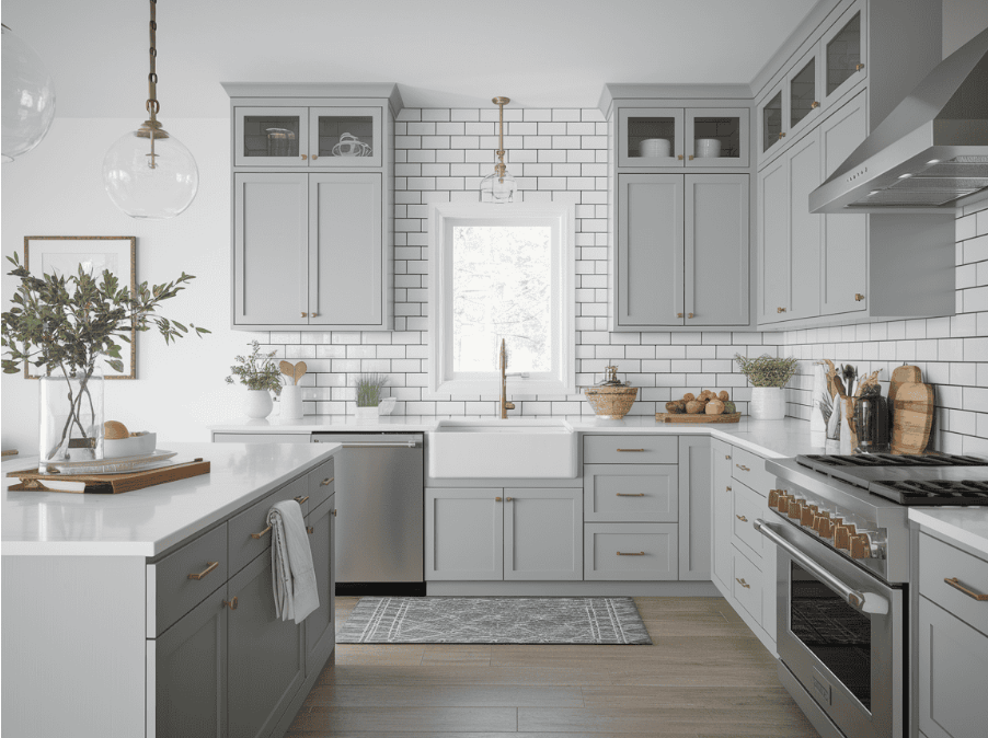
Light dove gray offers a cool, balanced neutral tone that doesn’t dominate the room. Its soft appearance helps cabinets fade subtly into the background, creating the illusion of more space. It also harmonizes easily with metal accents and pale surfaces.
4. Warm Cream
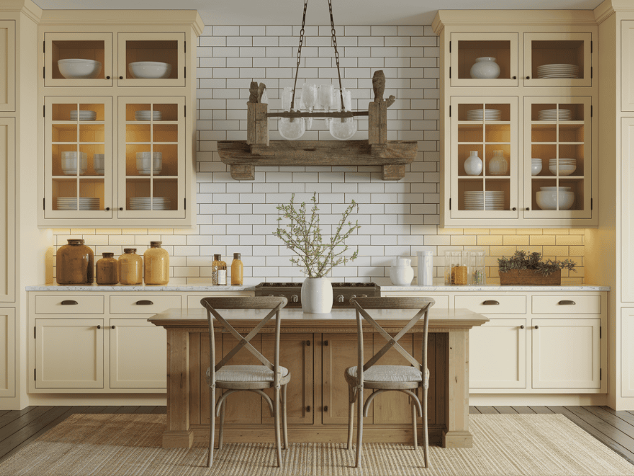
Warm cream brings a gentle golden hue that adds warmth without overwhelming brightness. It feels inviting and relaxed, working well with traditional furnishings and warm lighting. The shade is ideal for homeowners who want light cabinets but find pure white too sterile.
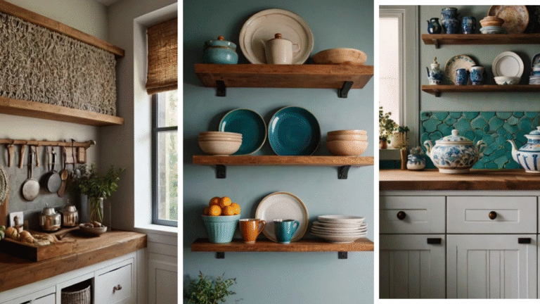
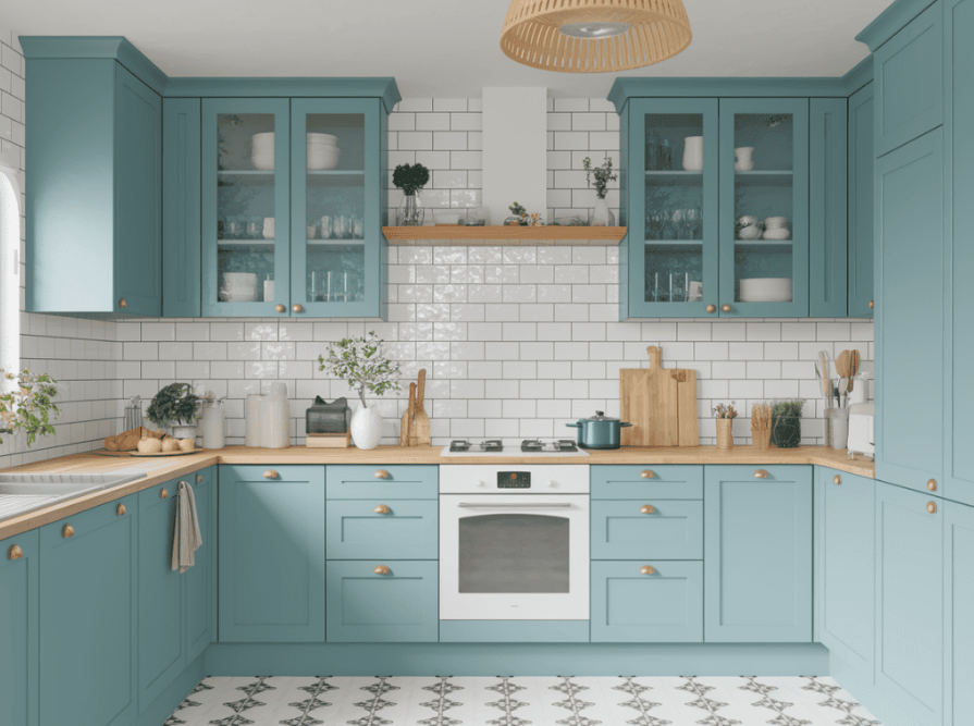
5. Powder Blue
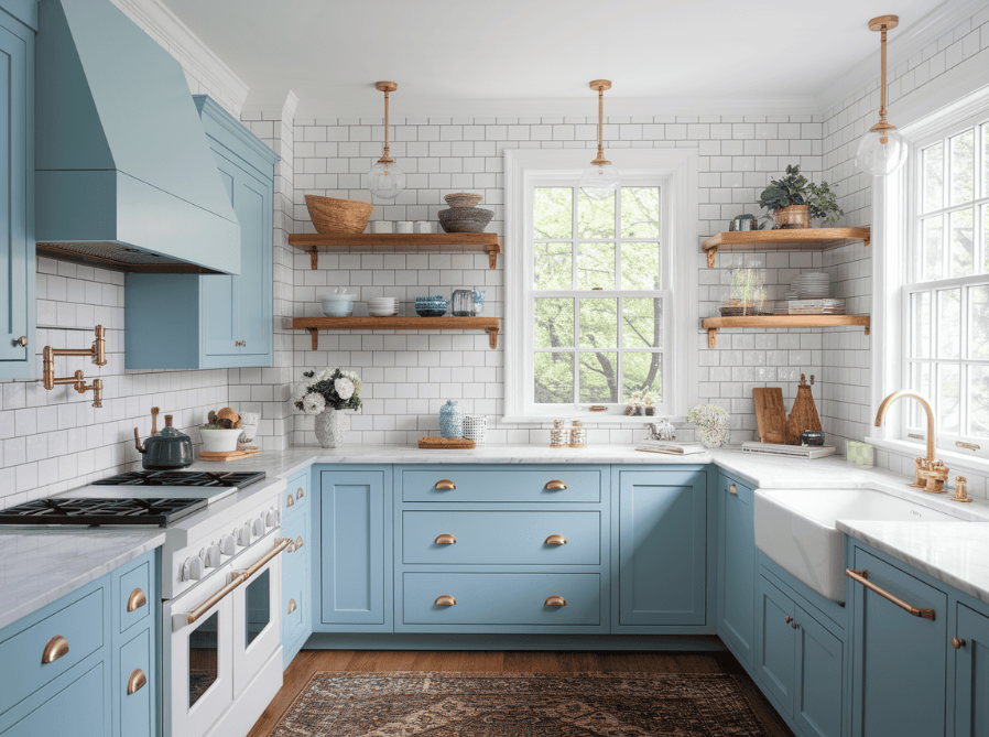
This pale blue adds a whisper of color without closing in the kitchen. It has a timeless quality that lends charm to a variety of decor styles. Powder blue helps draw the eye upward when used on upper cabinets, subtly making the room feel taller and more expansive.
6. Matte Sage Green
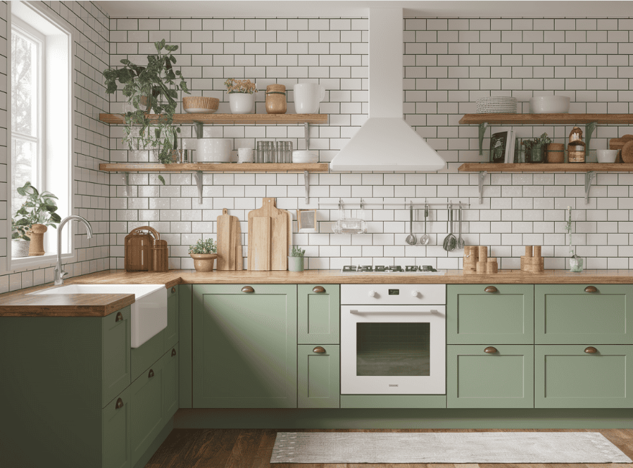
Matte sage green delivers an earthy, natural touch that feels grounded yet spacious. Its subtle tone brings a quiet energy to the kitchen while helping the walls feel farther apart. The matte finish keeps the color soft and understated.
7. Blush Beige
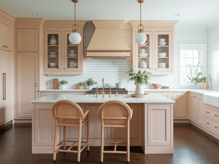
Blush beige blends warmth with a hint of rosy tone, creating a fresh and cozy feel. It reflects just enough light to keep things bright without looking bland. This color helps soften the edges of cabinets and pairs beautifully with light surfaces and warm metallics.
8. Cool Mint Green
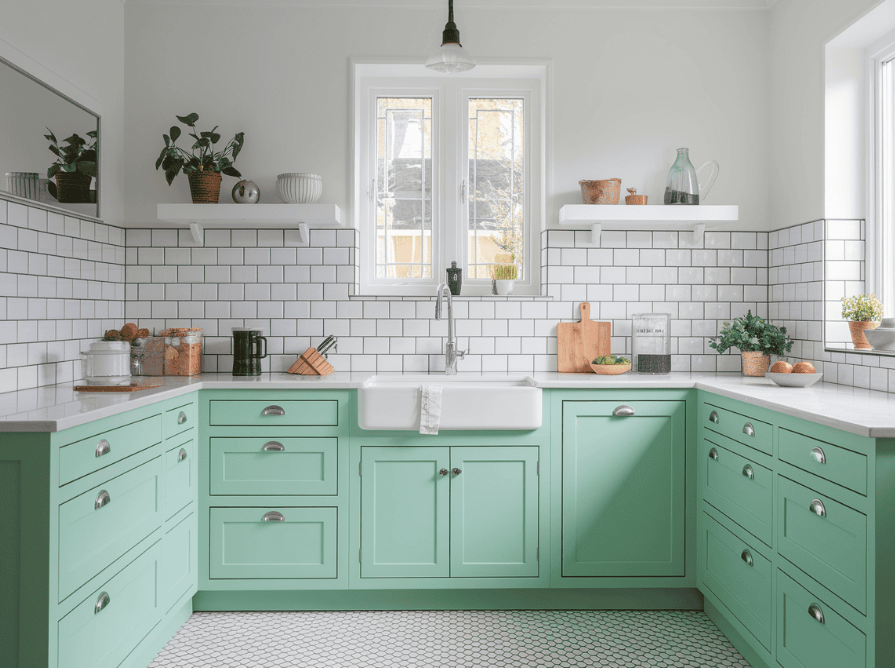
Cool mint green introduces a clean and refreshing look that helps small kitchens feel brighter. It’s a soft, cheerful shade that works well in a variety of lighting conditions. Its subtle character makes it an ideal choice for base cabinets, offering both color and lightness.
9. Frosted Lavender
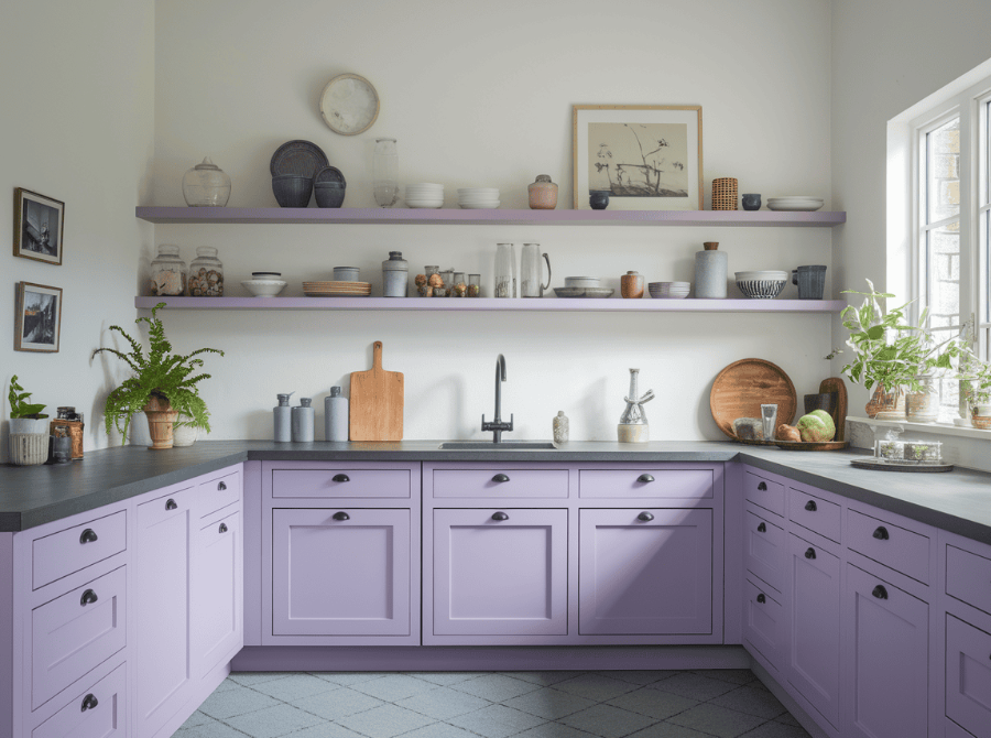
Frosted lavender adds a gentle tint that gives personality while maintaining an open look. The pastel shade creates a quiet and peaceful mood without overpowering the space. It’s perfect for those looking to incorporate a soft color that doesn’t distract from the room’s layout.
10. Pale Butter Yellow
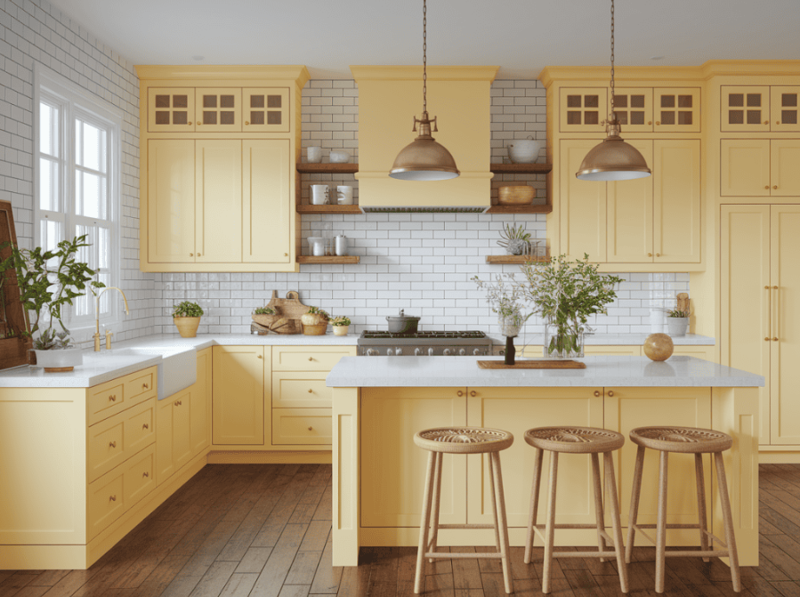
Pale butter yellow delivers a soft burst of sunshine that lightens the entire kitchen. It works particularly well in areas with limited natural light. The warm tone adds comfort and friendliness, enhancing the feeling of space while keeping the environment relaxed.
11. Greige (Gray-Beige Blend)
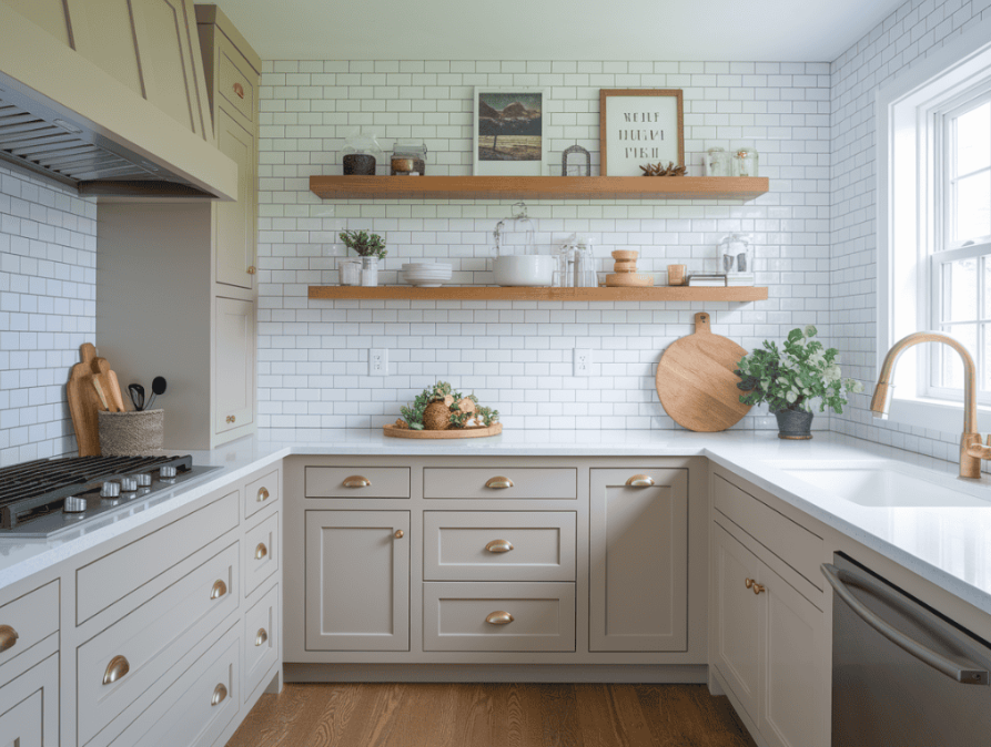
Greige strikes a balance between cool and warm tones, providing a versatile backdrop that visually stretches the room. It stays in the background while allowing other elements to stand out. This subtle color keeps things light and works across many design styles.
12. Sky Blue
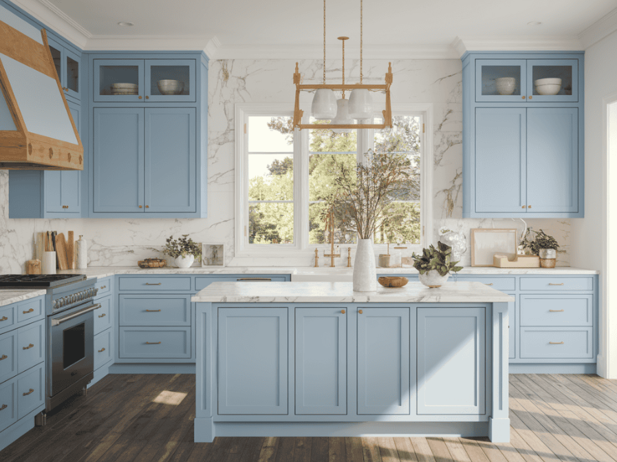
Sky blue introduces a sense of upward lift, much like a clear day. It opens up small kitchens by drawing the eye and creating a light, breezy mood. It pairs effortlessly with light woods and whites, making the room feel expansive and refreshed.
13. Light Oak Wood Tone
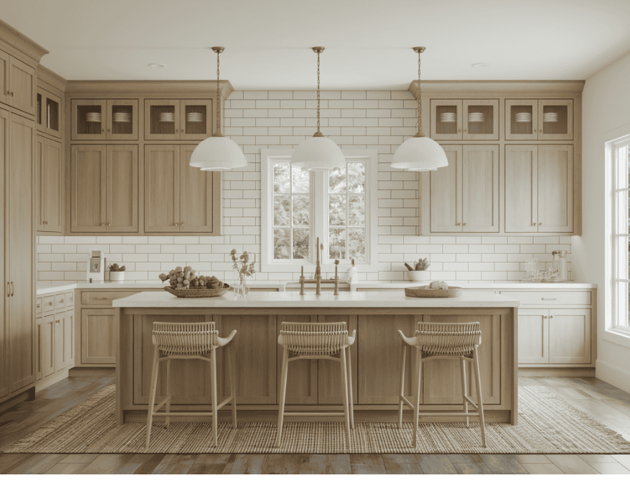
Light oak brings in natural texture and a soothing, organic look that reflects light without adding weight. It’s an ideal tone for those who want wood cabinets that don’t darken the space. The pale finish contributes to a simple, clean aesthetic.
14. Pearl Gray Gloss
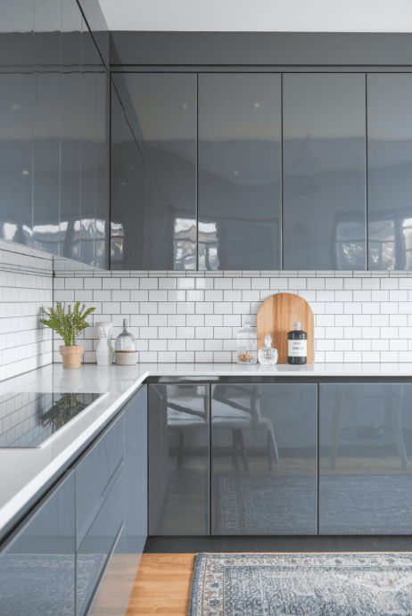
This light gray with a glossy finish adds shine and depth to the kitchen. The reflective quality of the gloss enhances brightness, making tight areas feel larger. It’s a modern choice that still feels soft and approachable.
15. Antique White
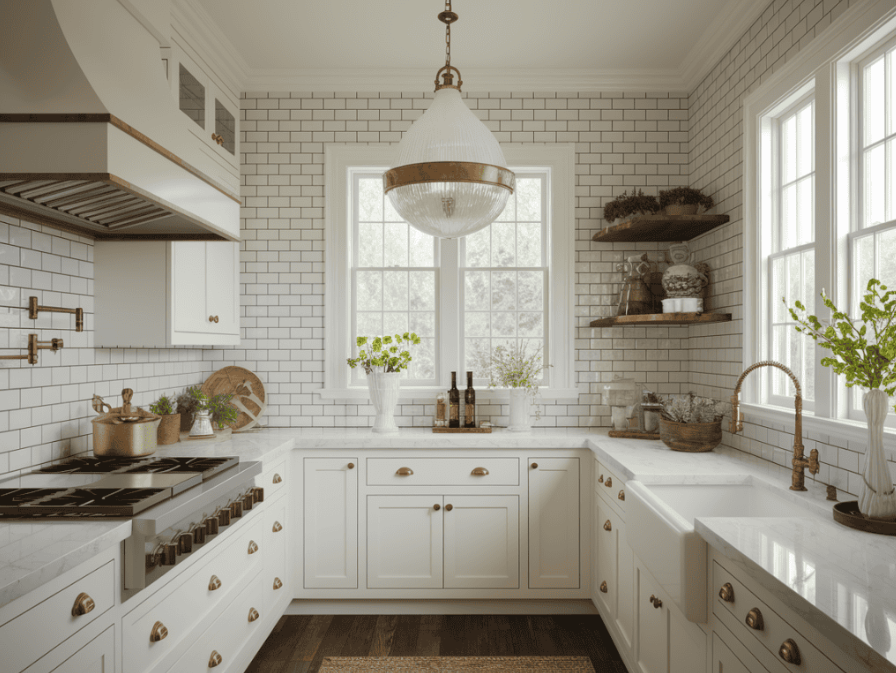
Antique white introduces a slightly aged look that warms the space with charm. It’s an excellent fit for homes with traditional or rustic details. The color maintains brightness but brings more character than flat white, enhancing the room’s texture without adding clutter.
16. Dusty Rose
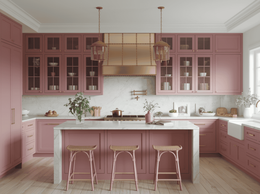
Dusty rose provides a muted touch of blush that makes the kitchen feel gentle and welcoming. It enhances brightness while offering a soft, vintage-inspired appeal. The subtle hue helps stretch visual boundaries and makes the space feel more relaxed.
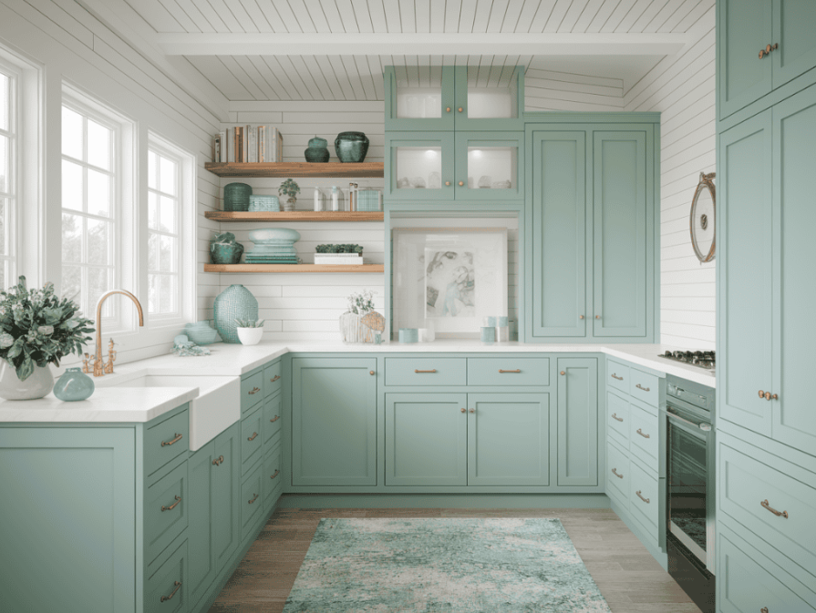
17. Seafoam Green

Seafoam green delivers a calming, watery tone that evokes a beachy, open feeling. It’s ideal for coastal or casual kitchens where you want a light, refreshing palette. The color helps soften rigid corners and adds just enough visual movement without being too bold.
18. Champagne Beige
This shimmering neutral adds a hint of elegance to the room while keeping things light. It works with a variety of materials and brings a refined touch without feeling stuffy. The soft reflection in the color adds a subtle sense of depth and luxury.
19. Pale Pistachio
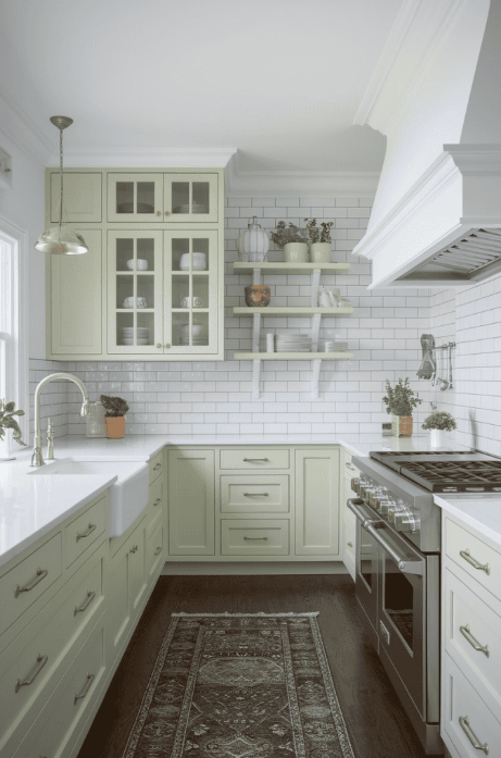
Pale pistachio offers a soft, playful shade of green that’s cheerful yet restrained. It provides a fresh, lively feeling that lifts the space without overpowering it. The color is perfect for kitchens that need a light touch of personality.
20. Ivory with Gold Hints
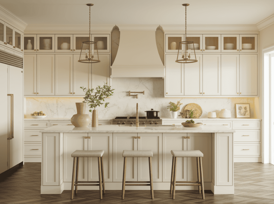
This creamy tone with golden undertones brings warmth and elegance together in one soft shade. It reflects light gently while offering a more refined look than flat ivory. The color pairs well with natural materials and metallics, creating a sophisticated yet open atmosphere.
21. Cloud Gray
Cloud gray is a subtle, misty neutral that feels both airy and comforting. It provides a softer alternative to white while still keeping the room feeling open. This shade is great for blending with wood or stone features and won’t make the space feel closed in.
22. Soft Terracotta Wash
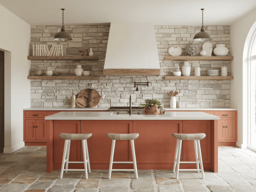
This gentle earthy tone adds a touch of rustic charm while maintaining openness. The pale wash ensures the color doesn’t dominate the space. It works beautifully in Mediterranean or farmhouse kitchens, giving warmth without weight.
23. Pale Blue
Pale blue instantly cools and lightens the space, helping to expand its feel. It’s a classic color that works in many kitchen styles. The soft tone enhances the ceiling height visually and brings a sense of calm and flow to the room.
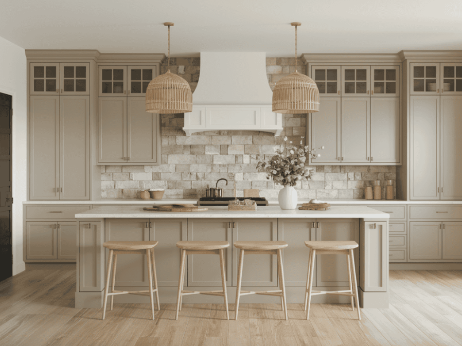
24. Light Taupe
Light taupe combines earthy and neutral qualities to create a calm, adaptable tone. It supports both warm and cool accents and helps kitchens feel grounded but not closed off. The shade is especially useful in modern designs looking for soft contrast.
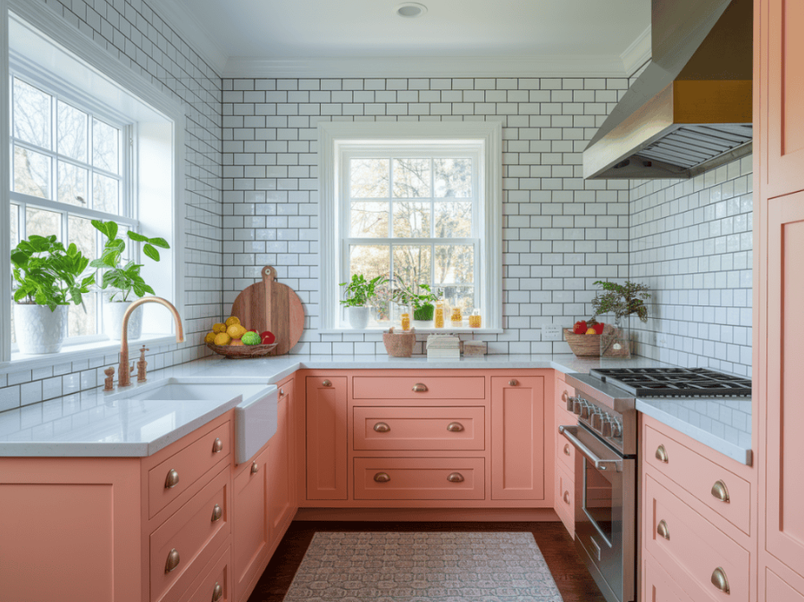
25. Pale Salmon
Pale salmon brings in a soft touch of warmth with a hint of pink-orange that adds energy and brightness. It’s a welcoming, unexpected choice that makes the kitchen feel friendly without overwhelming the design.
Conclusion: ( Cabinet Colors )
You don’t need to remodel your entire kitchen to make it feel larger. The right cabinet color can completely shift how open and bright the space feels.
Whether you’re drawn to creamy neutrals, subtle pastels, or soft wood tones, these shades were selected for their ability to expand a room visually while keeping it stylish and personal. Choosing the right tone lets your kitchen breathe, feel lighter, and truly shine.